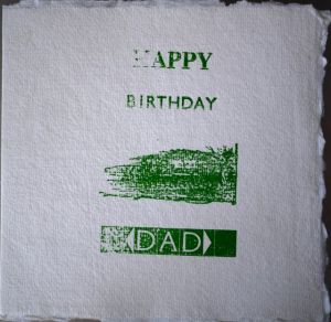
For project 2 I decided to try to print a birthday card for my Dad.
I wanted a mixture of text and a picture. So off I went and rummaged through the bits I had and spent ages played with them and trying to set them in the forme.
What I realised was that something relatively simple is not as easy as it looks if there is lots of space to be carefully filled and the forme must made nicely tight so nothing wobbles when you print.
After lots of testing and packing the print bed and so on I got a few acceptable prints.
Voila!
It has rather a school project quality I feel.
It was hard to get a good print impression from both the font and the countryside scene.
I think my Dad liked it, he said he did.
forme = a technical term for the composition of text and any pictures laid out ready to print with spacing material and locked tight in a frame specific to the print press being used (the frame being known as a chase)
note:
ink: Light Green (Hawthorn Printmaker Supplies Stay Open Ink)
paper: cotton rag pre folded square card with envelopes 210gsm medium texture (Khadi Papers)


