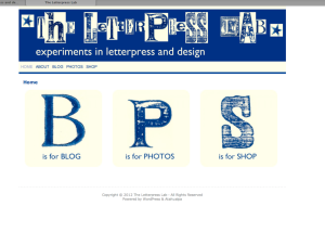
I decided to create a website for some of my letter press stuff, to operate alongside this blog.
Here is it is. The header and buttons are all digitally manipulated letterpress prints with wooden letters from my small collection. The Gill Sans at the bottom of each button is digitally added.
I’ll be using it to share a bit more about me and my letterpress interests with more detailed posts on some of my projects. Eventually there will be a shop on the site, at the moment you can find some of my items for sale on etsy
Here on posterous I’ll be gathering things that inspire me, so a sort of design and letterpress scrapbook.
Hope you enjoy both of them.

The BPS abbreviation sounds fantastic, in a sense that you can also use it to market your blog. Fonts play a big role in terms of website legibility and comprehension. It’s always great to see fonts that are easy to read.
Hmm, who thought of using that abbreviation? Richard is correct??? I just wonder if you could’ve placed the "BPS" on the header. The viewers won’t have a hard time guessing or looking out for what the abbreviation means. On the other hand, the color combination you used is great. I love those two colors.
You have written a very impressive post providing highly valuable information. You have a very good feel for getting the right information out to the people through blogs. <a href="http://www.webhostings.in">hosting in india</a> || <a href="http://www.webhostings.in">hosting website</a>
Beautiful website design! I suggest you put on a recycled or embroidered paper as a background for your homepage to accentuate the ???BPS??? more and to fully emphasize your incredible craft. With it, your visitors can easily have an idea that you are skilled with experimenting with papers and that you are offering and accepting letterpress orders. <a href="http://www.onlinemarketinggiant.com/internet-marketing-kansas-city/">Kelly Storie</a>
I agree with Kelly. It would be great if you put something related to your craft. By doing this, you???ll let the visitors of your site to be familiar with letterpress. Just by looking at the design of your site, they will be able to tell exactly what your business is all about, in which they will become eager to explore your website and check out the services that you offer.<a href="http://www.edgenet.com/retailersdistributors/product-data-management">Jamie Viggiano </a>
I agree with Richard???s point about the role of fonts in web design. I love to see font styles that have a professional look, which is ideal for business-related sites. Here, I came across a blog that tackles different font styles for web designs: http://www.hongkiat.com/blog/top-10-fonts-designers-love/ It???s a pretty great compilation of the most popular fonts used by designers.